Wood, ceramic, acrylic paint Height 12cm August 2017
A sculpture composed of four identically shaped, differently coloured blocks of wood mounted on two ceramic tiles. The wood blocks are set at an angle to the vertical to give the impression that they may be partly concealed within the base on which they stand. The work is deliberately made from mundane material at a small scale which gives the work a surprising intimacy.
The piece is composed of scrap material that has been recycled or upcycled to create the artwork. It is no doubt influenced by the Arte Povera movement which used discarded artefacts to construct artworks. It is also influenced by the current awareness of environmental issues and the problems posed by consumer waste.
I was interested to see during a shopping trip into London today (in April, 2017) that the current ‘branding animation’ that is running on all of the Apple computers on show in a department store that I visited had something of the look and feel of some of my own animations (shown below). This is probably a coincidence. I can’t imagine that the designers in Apple’s branding department were trawling the internet and happened to come across my work. And then chose to adopt some of its style. Although you never know. They have to keep their fingers on the pulse after all – although I’m not sure how on the pulse my videos are, as the video that the Apple animation most resembles is several years now. The Apple animation, which I can’t find on the internet, and therefore can’t point you towards, features the leaf on the Apple logo detaching itself and replicating itself to form a rotating circle composed of multiple copies of itself, changing size and colour but always retaining a degree of graphic simplicity. The animation sequence to me had something of the feel of mine. Of course it may only be me who sees any resemblance, due to my heightened sensitivity towards the design factors of the work I created. My work uses circles rather than leaf-shaped lozenges, my circles interact where they overlay while Apple’s simply overlay, and mine are different colours, but that’s not much of a difference in my book. Assuming that there IS a resemblance of some sort I’m not sure whether to be pleased that a company of Apple’s status is using a similar style to mine, and thus validating it, or be annoyed that a company of Apple’s status is using a similar style to mine, as people would inevitably say “Your animation’s inspired by Apple’s, isn’t it?”.
A longer version of this animation, with more variation in the movement, can be seen here: Animation
A detail from an abstract moving image work from a series in which multiple copies of a single shape move and interact using simple computer algorithms, creating complex shapes. The series combines my interest in art and science.
Daedim: abstract moving image
Animation. July 2017
To see higher resolution videos and more information about this series click here.
Dark Cone Pencil drawing with ink additions on paper. June 2017
A pencil sketch from the imagination of a dark cone set in a featureless landscape. The slightly blurred quality of the pencil marks in this drawing combined with the sharper and darker ink lines create an unsettling atmosphere in the image.
An abstract moving image work from a series in which multiple copies of a single shape move and interact using simple computer algorithms, creating complex shapes. In this work forty-eight disks move in a circle creating strikingly different patterns and effects in the first and second halves of the work. This work is from a series of animations exploring the generation of complexity from simplicity.
A lot of land art and other art in the environment strives to use only natural ingredients in the composition of the art. This work however consciously uses artificial material in the form of a length of brightly coloured fluorescent plastic nylon cord.
The simplicity of construction of this piece is important. The cord is draped over the branch of a tree and is pulled tight downwards to create two perfectly straight, vertical, parallel lines. The work is meant to create slightly confused emotions in the observer. In the relative darkness of its woodland setting the cord stands out as a source of brightness, and the two parallel lines are aesthetically pleasing amongst the twisted shapes of the branches and the leaves. However, the cord is bright because it’s unnatural fluorescent plastic, and the parallel straight lines of the cord are similrly unnatural and are partly a reference to humanity’s need to impose order on nature. This work was created at the same time as most of the other paracord works on this site.
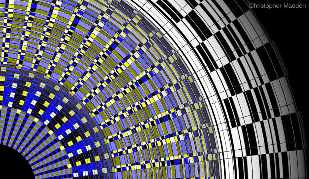
A Pop Art influenced design for a print. I’ve been creating geometrical designs for many years, partly because I was a teenager in the late 1960s when Pop Art and Op Art were very popular. This particular design was created quite shortly after I’d visited an exhibition by Brian Rice, so I’m sure that there are a few Brian Rice inspired influences in there. The use of digital technology has revolutionised the creation of geometrical art and op art, not only because it is now so much easier to create perfect geometrical shapes, straight lines and flat colours, but it’s also much easier to modify and alter designs. In the design here for instance any of the elements in the composition can be changed almost instantaneously, from the thickness of the yellow line to the colours that are used. Imagine doing that with paint.
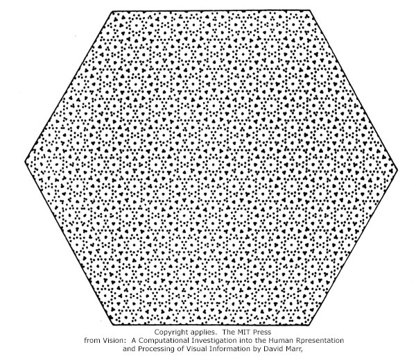
The perception of pattern. Ambiguously decipherable interlocking patterns of dots
Patterns generated by superimposed lines of dots
This image is inspired by a diagram by David Marr (1945-1980), a British neuroscientist who worked extensively in the field of visual processing. The David Marr image, shown below, was concerned with the way in which the human eye (and brain) will scan images seeking out understandable patterns. The image reminded me very much of some of the images that I’ve produced myself that involve the perception of pattern (before I’d seen the David Marr image), both in its form (arrays of dots) and its intension (the generation of ambiguously decipherable interlocking patterns).
Naturally I was inspired to deconstruct the David Marr image so that I could then try to create my own images based on what I found. The image at the top of this post is the first result. After studying David Marr’s image I worked out that a simplified version of it could be constructed from multiple versions of the basic star-like element shown below, with each element placed at an equal distance from the adjacent elements.
I call this star-like image a basic element, but that’s slightly inaccurate.
This ‘basic element’ isn’t really a basic element at all, because each ray of the star is a rotated repetition of an even more basis element, this being a row of thirty three dots in a straight line. See the image below. So in some ways the element in the image above isn’t really a star-like shape at all – it’s actually a set of six lines of dots rotated to different degrees.
Just one more thing. When you look at the innermost dots centre the star-like element above you see a clearly defined inner ring of dots and probably a less obvious secondary ring of dots. These ‘innermost dots’ are only ‘innermost dots’ if you choose to define the dots that are closer to the centre of the figure as a separate entity (a ring). In truth all of the dots in the image have the same status (other than that of their position), all being simply dots in lines, it’s just that the ones closest to the centre most easily form a ring when interpreted by our brains. Our brains can interpret the second set of dots as a secondary ring because you can, when you concentrate slightly, see that they are linked into this formation by association with their neighbours, although more loosely than is the case with the emphatic inner ring. What you won’t notice though is that the next set of dots outwards also form a ring, as do the next set and the next set all the way out to the end of the rows of dots. You can’t see this because for all of the dots beyond the secondary ring the dots are too well separated for the eye to associate them with each other. Somewhere in the space between the secondary ring of dots and the next dots outwards a threshold is crossed at which the brain can’t hold the dots together as a ring – the association is broken.
It’s interesting that this explanation was intended to be about the relatively complex image at the top of the post, but I’ve spent most of my time dissecting the simpler star-like image of the underlying element. Fortunately, the points that I’ve made about the underlying element are exactly the points that can be applied to the more complex image, and thankfully without the excessively complex structures within the complex image conspiring to befuddle the brain.
The David Marr image was featured in the introduction to the book Art Forms in Nature, featuring the drawings of German biologist and artist Ernst Haeckel (1834-1918), published by Prestel, 1998.
Ink sketch on paper 9x7cm. Digital colouring. April 2017
A small drawing from the imagination that is in one of my sketchbooks. I sometimes sit down with a sketchbook when I have a few minutes to spare and just draw whatever comes into my head, unmediated. It’s a sort of subconscious, automatic drawing. I used to think that such sketches would be a good way to encourage the development of new concepts and motifs without too much conscious thought channelling my work down well trodden pathways. However, I soon found that it was actually a way of revealing to oneself one’s inner obsessive visions, as variations on the same themes inevitably lay themselves out on the page time after time. This particular sketch, I see from the notes beside it, was drawn in the gardens of Hatfield House, a stately home in Hertfordshire, while sitting next to the very fine wisteria that’s growing there. There seems to be no link between the two. The colour in the image was added later, after scanning the sketch into my laptop.
This is a version of an artwork exploring reflections in mirrors, in this case based on a pair of shoes and a mirror. The shoes are positioned so that the reflection of each shoe in the mirror coincides exactly with the other shoe on the opposite side of the mirror, merging the real shoe and the reflection of the other shoe into what appears to be one shoe. Like a lot of my works that involve illusion this one explores the line between reality and our interpretation of what we perceive, our perception of reality.
Watercolour, gouache and ink on paper, with collage. 2017
This painting was an exercise in creating something from the subconscious without any preconceived idea about what I was about to create. It turns out to be a slightly sinister landscape, in the centre of which there is something that may or may not be a living entity. Early on in the development of this sketch this object looked more like a strangely shaped rock, but the addition of colour to it removed it from the rest of the landscape and turned it into something separate from the landscape. The blue dot in the image, which is a collaged circle of coloured paper, gives the possibly living entity an air of sentience, as it seems to be contemplating a strange sun or moon in the sky.
Colour Discontinuity 3 – the illusion of continuity
Front surface mirror, wood, acrylic. March 2017 20x20x14cm
A colored rod reflected in a mirror, positioned so that the reflection of the rod coincides with another rod of a different color on the other side of the mirror, creating an ambiguous optical effect.
A study of ambiguous visual stimuli to question the nature of perception and the interpretation of reality through the visual illusion of continuity.
The work is quite small and is intended to be viewed close up. Because of this the mirror used is a front surfce mirror (or first surface mirror), which is a mirror that is coated on the front rather than the back. As a result there are no ghost reflections caused by the thickness of the glass.
I’ve worked with mirrors since I was a teenager in the late 1960s, when I ground the parabolic mirror for an astronomical telescope that I’d constructed. I got it coated by Grubb Parsons, a telescope manufacturing company that constructed seriously large telescopes including the Isaac Newton telescope and the William Herschel telescope. I used that mirror in one of my early mirror art experiments in about 1970.
This is a piece of art that I created recently that’s inspired by frequent unpleasant encounters with dog poo bags while out on walks in the countryside.
On one walk along a popular track up a mountain in Wales last year the poo bags were so frequent that they inspired me to conceive of the idea of a path lined with an avenue of poo bags. I’ve created a work based on the concept here.
For the work in these photos it was a small step to move a single bag from the countryside to the art gallery. The question is, is it a real dog poo bag or not? All that I can say is that it’s described as being ‘mixed media’.
Contemporary art and science – the creation of something out of nothing.
The image above is an example of work from a series that I created specifically to explore concepts from the worlds of science and philosophy. The original motivation behind the work was a wish to devise a visual means of expressing the concept that our incredibly complex universe is generated from the interaction of extremely simple fundamental forces that underlie the cosmos.
The image explores the generation of complex forms from simple forms. The image is composed of two identical square grids of regularly spaced small circles. Each grid is very simple in composition and represents the basic underlying ‘stuff’ at the very lowest level of existence in the universe. One of the grids is positioned above the other and is rotated so that the arrangement of circles on the two grids are at different angles to each other, meaning that they overlap.
A simple algorithm is applied to the overlapping grids. The algorithm dictates that where the black areas of the circles overlap the blacks cancel each other out, effectively leaving white (because the background is white). See the two examples below, showing differing amounts of overlap.
The two simple overlapping grids of circles generate surprisingly complex patterns, forming multiple and various interacting rings, some of which are obvious while others are fugitive and seem to come in and out of existence as your eye scans the image.
What’s more, when the two grids are rotated relative to each other the whole formation of rings and patterns shifts and changes as the grids alter their positions relative to each other. See how the patterns generated in the image below aren’t the same as those in the image at the top.
As I mentioned, the square grid in the image is a metaphor for the deepest, most fundamental and basic level of the physical universe, where nothing exists other than the simplest of all possible fluctuations in ‘nothingness’ itself (represented by the uniform circles).
Complexity and structure come into existence when this basic level of the physical universe – the grid of circles – interacts with itself, creating intricate forms that contain a new and complex internal structure. It is this complex internal structure that then gives rise to even more complex structures within the universe, for instance giving form to the elementary particles that act as the building blocks of the universe that we’re familiar with (while also giving form to the parts of the universe that we’ve got no inkling about, too).
I like to think of the patterns in the images as metaphors for ripples in the fabric of reality.
The videos show the shifting and transient nature of the complex patterns very well, expressing, I like to think, the way that the structure in physical reality “pops” in and out of existence.
A sketch of an idea for a sculpture, showing an umbrella mounted at the top of a conical structure that has short filaments protruding from it. I have a fascination with umbrellas for some reason. I think it’s possibly due to a mixture of their slightly Heath Robinsonesque mechanical structure – the hinged flexible rods that are levered outwards to support a stretched fabric cover – and their pleasing form when in the open position. Not to mention their practicality. And the fact that they are, despite their mechanical intricacy, very much taken for granted and dismissed as objects of great mundanity. My first ever published piece of artwork was an absurdist redesign of the umbrella, published in the Sunday Times in about 1974.
Environmental contemporary art – the Earth in a kitchen waste bin.
Kitchen waste bin, digital display. January 2017, Cornwall.
This is an example of my work on environmental issues such as global warming and climate change. This sculpture addresses the issues of over-consumption, environmental degradation and waste. I have been creating work about the state of the natural world and the environment since the 1970s.
From most angles (as in the image on the left, above) the bin looks like any conventional kitchen bin: however when viewed from the front (the image on the right, above) the opening in the bin is transformed into a portal to the cosmos, with the Earth suspended in the darkness of outer space.
The inside of the bin is pitch black due to the use of extremely matt black paint, while the Earth shines as a back-lit image.
The work carries the environmental message that the human race is treating the earth with contempt and that we are effectively placing the planet itself in the rubbish bin.
The work is a development of a concept that I had in about the year 2000, when I produced several environment-themed drawings of the earth falling into a wastepaper basket. The sculptural potential of using a real rubbish bin to create an illusion of outer space is a more recent development.
A version of this work was shown in my solo show at Tremenheere Sculpture Gardens, Cornwall in 2022 and was shortlisted for the Royal Academy Summer Exhibition in the same year.
Below is a video of the work showing the dramatic optical illusion effect of the work which can only be appreciated in three dimensions of on video.
A study for a surreal work composed of a pair of shoes with mouths and teeth. The teeth in this study were added digitally. These particular shoes were chosen partly because the holes at the toe end of the shoes give the impression of eyes. An unsettling aspect of this concept is that it is normal for a person to put their feet into shoes – however these shoes look as though they would devour anything that was placed in their ‘mouths’. They are almost lying in wait for feet to be placed inside them. This work may be interpreted as being a metaphor for the manner in which consumerism devours people (especially via the connsumerism of clothing and fashion). I thought of the concept of carnivorous shoes that devour their wearer many years ago and drew it as a sketch. It’s currently misplaced in my studio so I’m not sure of the year.
Study for a proposed sculpture. Photograph of a barograph, digital manipulation. January 2017
A photograph of a barograph digitally altered so that the arm of the barograph appears to be creating a fine pen and ink drawing of a landscape. A barograph normally draws a graph recording air pressure over the course of time on a sheet of graph paper attached to a rotating drum. This barograph is in the spirit of surrealism and dada – it is a scientific instrument appropriated for the purposes of art (In C P Snow’s two cultures thesis this would possibly count as cultural appropriation).
Mirrors, cord and light source: January 2017. W=30cm H=30cm
A study for a work composed of mirrors that are configured so that they create reflections round a symmetrical axis and also create reflections in infinite regression. The reflected object in this work is a single short length of coloured cord (about 40cm long), made to appear much longer by the multiple reflections in the mirrors. The cord is brightly coloured and is lit by a directional light source which gives the cord the effect of being a pulsating energy stream in a containment vessel, perhaps in a high energy physics laboratory. This work brings together my interests in art and science, especially the science of optics and perception.